- Trade Equity
- Posts
- The S&P 500 and the Nasdaq 100 hit new highs but negative breadth divergences abound
The S&P 500 and the Nasdaq 100 hit new highs but negative breadth divergences abound
Price chart analysis and commentary
John Navin
December 10, 2024
The handful of big cap tech and social media stocks that keeps heading up are helping to take the major stock indexes higher — but with fewer and fewer of the components going along for the ride. The negative breadth divergences are piling up and, sooner or later, they may begin to pull markets the other way.
Here’s how the new high on the S&P 500 looks:

If a sell-off commences, the first level of support would be the mid-November 5850 zone. A stronger bout of selling might find buyers at the late October/early November 5700 area. Significantly more pronounced dumping would likely find support at the September lows of 5400.
The new high on the Nasdaq 100 is here:

The first area of support is found just above the 20250 level where the index sold off to in mid-November. Another area of is “Support 2,” just below the 19750 area, the early October lows. More selling is likely to find buyers at the September low of just under 18250. Should a sell-off be especially pronounced, “Support 4” shows where buyers took over in early August at just under 17500.
Here are the breadth divergences now appearing for these indexes, starting with the percent of stocks above their 200-day moving averages:
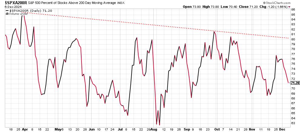
As you can see, it’s been trending downward since late May. Each new high on the S&P 500 price chart is accompanied by a lower high on this chart. This demonstrates how fewer and fewer of the S&P 500’s components are participating. Friday’s new high on the index lacks a confirmation on this breadth indicator.
Here’s the percent of stocks in the S&P 500 above their 50-day moving average:
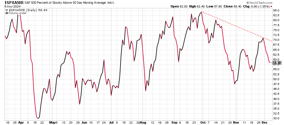
This shorter-term measure shows the same thing as the 200-day moving average chart: fewer and fewer stocks are going along with the “new high” for the S&P 500 index. This one peaked in late May and has been unable to reach that level since then.
The S&P 500 bullish percent index is here:
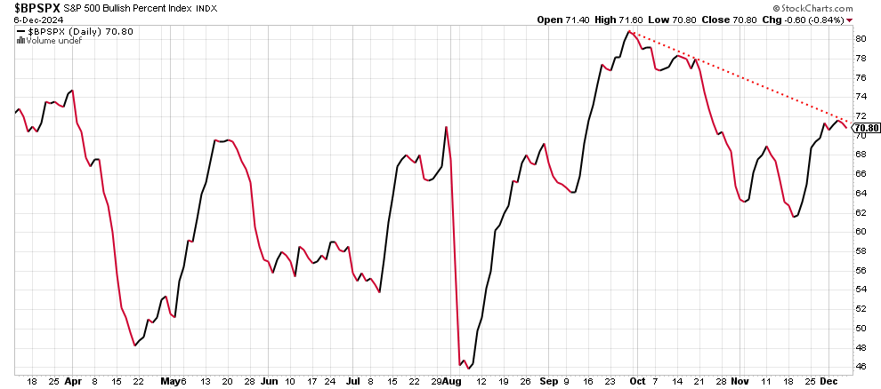
The chart shows the percent of S&P 500 stocks now showing bullish point-and-figure patterns. For those unfamiliar with the concept, here’s a good explanation from
Stockcharts.com: https://chartschool.stockcharts.com/table-of-contents/market-indicators/bullish-percent-index-bpi. It’s another measure demonstrating that fewer stocks are joining in when the index hits a new high: the red-dotted line connecting the late September peak with Friday’s level is an example of the weakness underneath the “new high” headlines.
The Nasdaq 100 percent of stocks above their 200-day moving average looks like this:
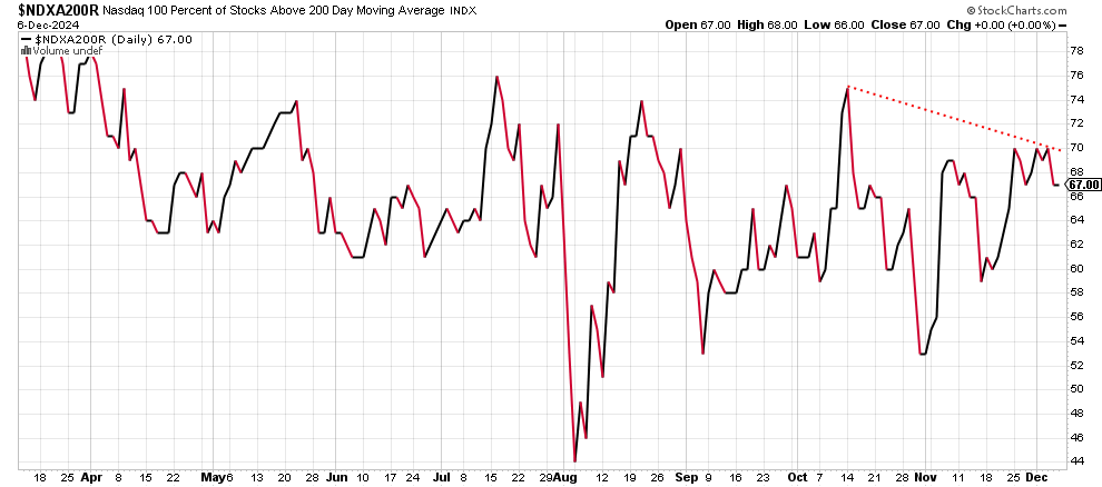
The red-dotted line that connects the high in October with the lower high in December shows the problem: it’s not a confirmation of index strength. It’s the opposite, in fact. The peak on this chart came way back in March, so it’s been awhile. What would be needed for real bullishness would be a higher high on this chart.
Here’s the percent of Nasdaq 100 stocks above their 50-day moving averages:

When the Nasdaq 100 hit a new high in October, this measure peaked at just above 80. When the index hit a new high late last week, this measure only fell further than November’s 72.5 and ended Friday at just 60. Underlying weakness should be the headline in the financial media.
The percent of Nasdaq 100 stocks in bullish point-and-figure patterns is here:
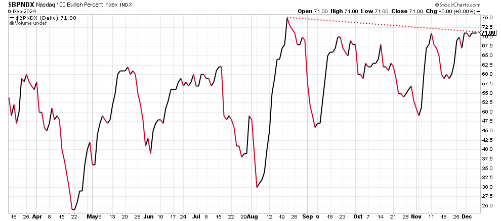
This breadth indicator peaked in mid-August at 75 and, with Friday’s new Nasdaq 100 high, could make it to only 71. The red-dotted line connects the two levels so you can see how it’s down trending. A truly bullish case could be made only if this measure had exceeded 75 last week.
Here’s the New York Stock Exchange Composite’s percent of stocks now trading above their 200-day moving averages:
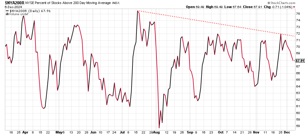
The peak came in July at just above 75 when the composite index hit a new high. Last week this measure had fallen to 67.91 even as the composite itself managed to hit a new high.
The percent of NYSE Composite stocks above their 50-day moving averages is here:
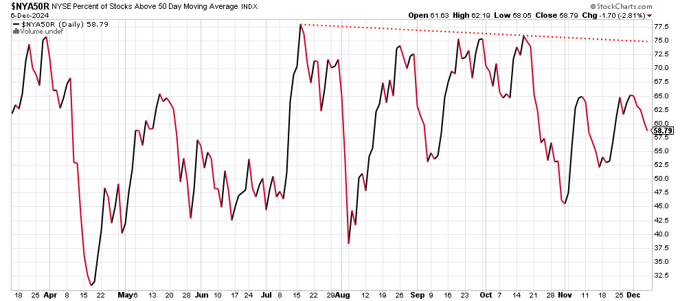
It’s the same basic story: a peak in July at 77.5 when the composite made a new high and then this measure is down to 59 at the end of last week.
Here’s the NYSE percent of stocks in bullish point-and-figure patterns:
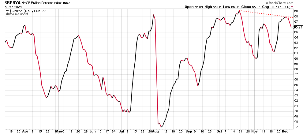
The red-dotted line shows a negative divergence from October to December relative to the new highs seen in the major indexes.
In my next post, I’ll offer a few short stock ideas: my opinion, not advice.
Reply